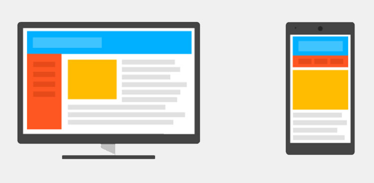
There are several aspects that are related to running a website and when it comes to running a mobile website, these aspects can’t be avoided. After the mobile-friendly algorithm introduced by Google itself, the debate over launching mobile-friendly web design was stopped. And now, the websites are designed to be mobile-friendly and visible in search results.
However, mobile-friendly web design is not sufficient. Website users always look for the similar user experience on the mobile devices as they find on desktops. Nobody likes to visit a website that doesn’t give similar seamless user experience. Hence, the best UX design is everything you need to make your visitors enjoy your website on every device.
Let us discuss 7 prime ways to improve user experience on the mobile-friendly sites:
1. Mobile-friendly website’s optimization for better speed
No user loves to visit a webpage that takes much time for loading. Most of the users wait just 10 seconds to load a website page. A recent study says that nearly over 44% of users stop visiting a website if it takes a long time in loading.
Furthermore, the fast loading websites also get better preference from Google. You can try installing different plugins to boost your WordPress site; some of them are WP Super Cache, W3 Total Cache and so forth.
2. Integrate easy and convenient navigation
This is one of the necessitous factors that decide the success of a website. Simply like speed, navigation makes you also lose many viewers in case they get poor navigation from you.
Your site must provide convenient and easy navigation to the users by the integration of a search bar, an easy-to-locate navigation bar and other essential components of a website. It is possible to shrink down the navigation bar to your website’s top for obtaining better navigation.
3. Mobile-friendly web design
You must understand that the navigation on a mobile device completely differs from the desktop website navigation. The users who browse websites through mobile devices are basically object-oriented. Users look for easy web design to reach what they want to, without wasting their time on visiting a page that is not worthy.
So, you can see that a website requires having clear and easy web design which is helpful for the users to avail the necessitous info on your site with an ease and convenience. Users don’t prefer zooming little elements on the sites as they seek the design which is clear like desktop navigations.
Hence, for better user experience, you should remember all factors while initiating a mobile-friendly web design.
4. Color optimization of your mobile site
Mobile devices vary in numerous features and color is one them. The smartphones like iPhone and Nokia support for 16 million colors whereas HTC and BlackBerry support just 65000 colors. So, when it comes to designing web graphics, this is surely a big difference.
And it’s a true fact that with millions of color support, a better graphics can be displayed that feature sharper and brighter pictures. However, you can’t be choosy and should ponder every type of device to offer the best user experience.
5. Accentuate your call-to-action
As earlier mentioned that mobile users are object-oriented, they want a direct route to the call-to-action which enhances the conversion rate. So, the landing pages should be constructive with strong but easy call-to-action buttons. You can just put ‘Subscribe’, ‘Get a Quote’, or ‘Buy Now’ in bold letters so they can be easier to read and click.
Also, you can opt for a highly visible color like green, red or orange to make the call-to-action a little different. In accordance with Apple, the basic call-to-action button must have at least 44 pixels in size so that it becomes to be clicked.
6. Eliminate lengthy forms
Nobody prefers wasting time on filling out a lengthy form and for mobile sites, it must be avoided. Hence, you should understand what users prefer and provide them the simplest way of availing data they want from you. While designing forms for mobile device users, ensure to incorporate necessary fields only.
Additionally, make every field and submit button clear and bold. If the buttons are readable and clickable, it will make the form filling process smoother.
7. Epitomize relevant information
Simply like blog archives, categories, and search options, summarize all relevant information pieces on your site that the users seek. Your users should be provided with the capacity of scanning all tutorials, articles and all other essential things easily by tapping on a blog archive option or a category.
Verdict
So, these are 7 major ways to enhance the user experience on a mobile-friendly website. Nevertheless, before applying these tactics, you should know that these are not just for increasing ROI and conversions on your mobile site but also for providing a better user experience and an easier navigation.


 Sanjay Dey