As digital presence is gaining importance, businesses are putting in efforts to introduce easy-to-use websites that are also atheistically pleasing.
The competition is high and to ensure a higher number of clicks on your site, you have to choose the right company for effective web design.
The format should be neat and users should be able to understand how to check everything on the site.
This will also reduce the bounce rate. In this regard, you have to understand that a poorly designed site will perform poorly and wouldn’t fetch the desired results.
People will tend to spend less time on your site and your business will suffer from low conversions. In fact, it will have sub-optimal Google Analytics metrics.
So what are the main attributes of a good website?
- Aesthetically pleasing
- High engagement
- Effective
- Easy-to-use
Your site should tell about your services or products, the company’s success story, mention the credentials, etc. You will surely be able to design a great website with great content by hiring a good team.
The professionals will understand and analyze your business, study the target audience, and create an effective and practical site for you. Here are some of the qualities of a good site.
1. Purpose

The first step to this understanding and analyzing the purpose of a company’s site. What kind of business do you have? Will potential customers visit your page or would they visit for some sort of entertainment? The idea is to understand the purpose and then conduct the research.
2. Communication

Your site must be able to communicate with people who visit it. The content should be crisp and must contain all the necessary data.
Using bullet points, headers, etc. should help you achieve the same. Hiring a team with a good and experienced content writer is a smart decision.
3. Font

Readability is a huge factor when it comes to designing a website. Fonts like Arial and Verdana are easier to understand. The team you are hiring must understand the importance of typefaces.
You must have a clear conversation with them so that they also know what you are looking for. Other factors, such as font size also hold importance. You must go for web-friendly designs. There should be any kind of typography as well.
This can harm your brand image. If people can’t understand the text easily, then it can be quite worrisome. You can’t let them struggle when they are going through your site to make a purchase or gain knowledge of your company.
Every single point is relevant when it comes to building a brand personality. Your site is the digital face of your company.
4. Colors

The color palette should complement each other. Choosing hues that clash is a big no-no. The right colors would enhance the user experience. Think of yourself as a user – don’t you think you tend to look at sites or pages where the colors look aesthetically pleasing and thus create balance and harmony? Do not use vibrant colors (apart from headers, etc.)
Also, one should pay attention to white space or negative space. This will make sure that your website doesn’t look cluttered.
Vibes related to color palettes:
Dark browns and blacks – rustic feel
Pastels – modern and clean
5. Images

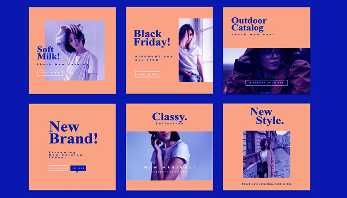
Choose the right pictures of your website as they say a lot about your company or your brand. Get high-resolution pictures clicked for the best results. This will surely impress the visitors. It will help you connect with your audience seamlessly.
The picture is definitely worth a thousand words. It will help you establish your brand in the best possible ways. You can also invest in stock photos to make sure that your website looks perfect. Including a tutorial video (if it is relevant) also makes sense.
6. Navigation

A designer should have a good idea about the navigation of a site. People should find it easy to take action and move around the site. He or she should design buttons, follow the three-click rule, etc.
Anyone must follow the rules so that the website is effective and you can make the most out of it. The designer should also be creative enough to give you some inputs that will boost usability.
7. Grid-based layouts

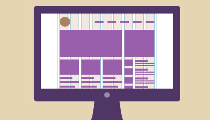
This is yet an important factor to focus on. The site shouldn’t look messy and thus, you should go for grid-based layouts. The site should have symmetry as well.
8. F pattern or z pattern

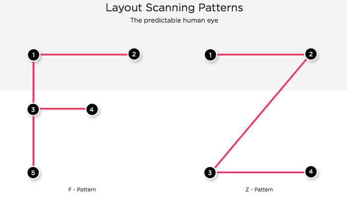
These patterns make it easier for people to understand what is written on the site. Certain eye-tracking studies showed that all these patterns are the eye’s natural path which leads to a smooth visual flow.
9. Load time

The site should load within seconds. If it takes more time, then expect more bounce rate. Leave it to the designers who know image size optimization, HTML, CSS, JavaScript, etc.
10. Mobile friendly

The site should be mobile friendly as well. This is another vital point that holds immense importance in today’s date. If it is not, then you have to rebuild it in a responsive layout.
Apart from these points, the designer must make sure to optimize buttons as well as focus on CTA. As far as the content is concerned, you must avoid big chunks of paras.
No one is interested to read big parts – they just don’t have the time to. It can even have a negative impact on your brand image.
As an entrepreneur, you must ask the web designer to pay attention to minute details as well. This will make your site visually appealing and convincing. The message would be loud and clear. No one will face any confusion. The design should be consistent so that it is impressive enough.
All the best.
Leave a Reply