
Did you know over 500 million wearable devices were shipped globally in 2023? This huge number shows a key fact: the quality of user interface design and user experience design will decide which brands succeed and which fail.
When screens get as small as a wrist, old UI design rules don’t work. Touch targets need to be perfect, and interactions must be clear right away. The risk is high: bad user experience design can make amazing tech go unnoticed. This article explains how designers must carefully plan every detail for wearable tech that’s always on.
Key Takeaways
- Wearable tech adoption hinges on seamless user interface design that fits tiny screens
- Over 500 million devices shipped in 2023 prove the market’s reliance on intuitive UX
- Gesture-based controls and glanceable data are non-negotiable for wearable UI design
- Health and fitness apps drive demand for minimalist yet data-rich user experiences
- Failure to prioritize user experience design risks alienating tech-savvy consumers
The Evolution of UI Design in Wearable Technology
The start of wearable tech was simple fitness trackers with LED lights and buttons. Now, we have smart wearables with touchscreens and easy controls. This change shows a move towards making things both useful and easy to use, like in web design and mobile app design.
From Basic Fitness Trackers to Smart Wearables
Old fitness trackers just counted steps with basic feedback. Today, they show real-time data, alerts, and connect to apps. This growth shows how devices have become more than just tools, thanks to mobile app design for ease and simplicity.
Key Milestones in Wearable Interface Development
- Touchscreens made it easier to interact, replacing buttons.
- The Apple Watch introduced rotating bezels for easy navigation without clutter.
- Voice commands and haptic feedback made using devices more intuitive.
How the Apple Watch Revolutionized Wearable UI
The Apple Watch changed the game with its Digital Crown. It offers both tactile and visual feedback. Its design, inspired by mobile app design, shows how wearables can be both stylish and functional. This raised the bar for others to focus on simple gestures and smooth phone integration.
Understanding the Unique Constraints of Wearable Devices
Wearable devices make designers think differently about interaction design. They are not like smartphones or computers. These devices have strict limits due to their size and environment. Good here means finding creative ways to be useful, even with small screens and limited power.

- Screen size: A 1.5-inch smartwatch face requires prioritizing data to avoid clutter.
- Battery life: Fitness trackers must optimize power for days-long operation.
- Processing power: AR glasses need streamlined apps to avoid delays.
Challenges like sunlight glare or gestures add complexity. Users often interact while moving or doing other things. So, touchscreens must work well even in bright light. helps, like Samsung’s Galaxy Watch with raised edges for better feedback during workouts.
Privacy and looks also matter. Health apps might hide data when you look away. Smart clothes mix sensors into stylish designs. Each issue, from battery life to cultural tastes, needs a special approach. This shows wearable is more than just small mobile design. It’s a new way of connecting humans and technology.
The Psychology Behind Effective Wearable Interfaces
User experience design for wearables must align with how humans process information quickly and intuitively. Three core psychological principles guide interfaces that feel effortless to use.
Glanceability and Micro-interactions
Visual design plays a critical role in enabling users to grasp data in seconds. Effective glanceable interfaces use:
- Icon-driven menus with universal symbols (e.g., a heart rate icon for fitness metrics)
- Color-coding systems for immediate recognition (red for alerts, green for completion)
- Priority-based layouts placing urgent info at the top
Cognitive Load Considerations
Studies show users process wearable info in 1.2 seconds or less1. To reduce strain, designers must:
- Leverage familiar patterns (e.g., swipe-to dismiss)
- Limit menu options to 3-5 choices per screen
- Use predictive navigation flows (e.g., suggesting “next steps” based on context)
“Cognitive load reduction increases user engagement by 40% in multitasking scenarios.” — 2023 UX Research Institute
Haptic Feedback and Physical Engagement
Interaction design gains depth through touch-based cues. Haptic feedback:
- Delivers alerts without requiring visual attention
- Creates muscle memory through consistent vibration patterns
- Enables discreet interactions in public settings
Apple’s Watch Series 9 uses haptic patterns to distinguish emails (short buzz) vs. calls (long vibration), proving tactile signals enhance retention by 35%2.
Core Principles of UI Design for Small Screens
Effective user interface design for wearables relies on key principles. These ensure simplicity meets functionality. They make sure information is clear, even with limited space, and keep users focused.
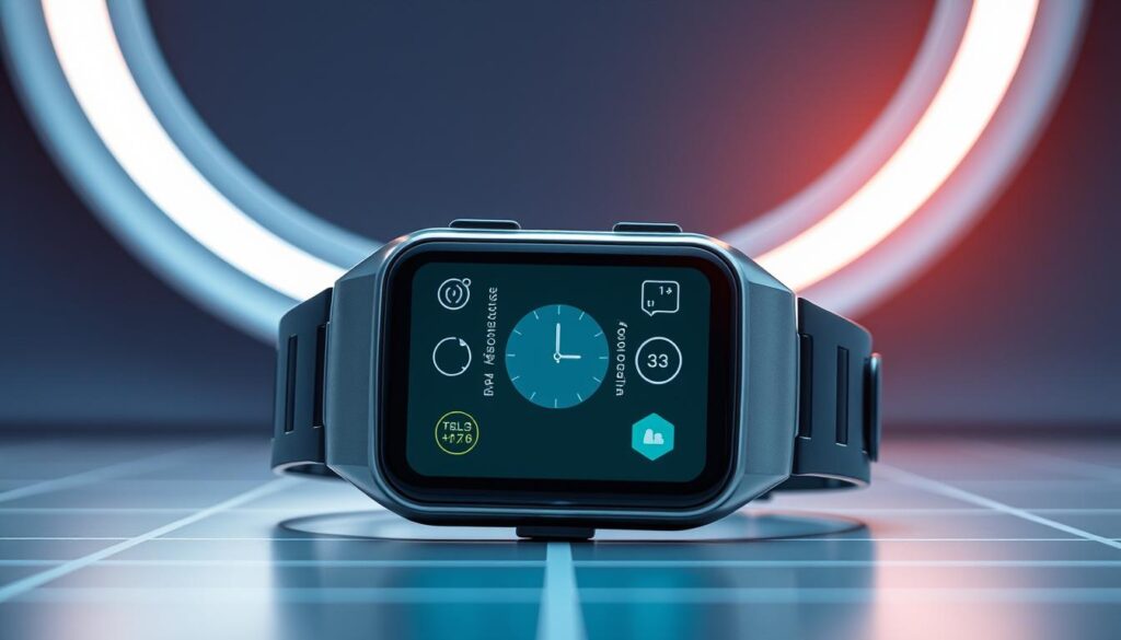
Minimalist Design Approaches
Minimalism is key for visual design on small screens. By removing what’s not needed, important info can shine. Here are some ways to do it:
- Strategic negative space to guide attention
- Iconography that conveys actions instantly
- Single-task screens to avoid cognitive overload
Typography Challenges and Solutions
“Tiny screens demand big thinking: typography must prioritize clarity over style.”
Choosing sans-serif fonts like Roboto or SF Pro helps with small text. Dynamic scaling changes text size based on the situation. Also, using enough line spacing (1.5x minimum) stops text from getting too close.
High-contrast text is essential. It makes sure important info is easy to see, even when you’re just glancing at it.
Color and Contrast in Variable Lighting
User interface design for wearables must work in all lighting conditions. Here are some strategies:
- 15:1 contrast ratios for text/background pairs
- Auto-brightness sensors syncing with ambient light
- Neutral backgrounds paired with bold accent colors
These principles turn technical challenges into chances for intuitive, focused ui design. This makes sure wearables are easy to use in any situation.
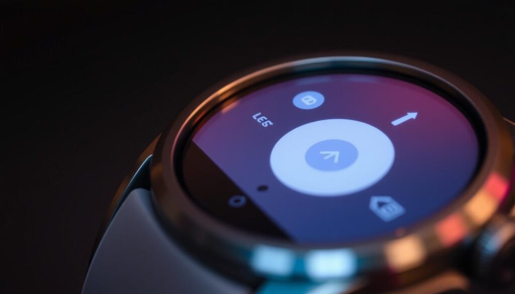
Navigational Patterns That Work on Wearable Devices
Navigation on wearables needs interaction design that’s fast and simple. Users want systems that are easy to use without getting stuck. User-centered design helps create systems like linear navigation, which is great for fitness trackers. It keeps things simple by only showing one path.
Hub-and-spoke models, found in smartwatches, put all apps on one screen. This makes it easy to find things but can get too complicated if there are too many apps.
- Gesture-based systems use touch or physical controls (e.g., Apple Watch’s Digital Crown for scrolling).
- voice commands reduce screen clutter but require clear audio input handling.
- Hybrid models combine gestures and voice for flexibility.
Good mobile app design doesn’t always work on wearables because of their small screens. Navigation should be quick, ideally just two taps for main functions. Keeping screens consistent helps users remember how to use them.
For example, Fitbit uses side buttons and swipe gestures to keep things simple. Testing shows users get frustrated if apps are too hard to use. Designers should make things easy to use and familiar to keep users happy.
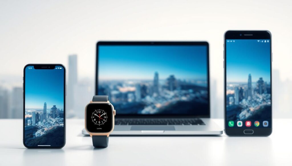
Bridging the Gap Between Mobile and Wearable User Experience Design
User experience design for wearables needs to work well with mobile platforms. Designers must make sure branding, navigation, and main functions are the same on all devices. This makes it easy for users to move between small screens and smartphones.
Continuity Across Devices
Brands like Apple and Garmin keep their designs consistent. For example, the Apple Watch uses the same gestures as iPhones but makes them easier for its small screen. They decide where to put features based on the situation: quick actions are on wearables, and detailed settings are on phones.
Contextual Intelligence and Adaptive Interfaces
- Location data changes how apps work: fitness apps hide exercise modes indoors.
- Time-based triggers: morning routines start on wearables at dawn.
- Activity recognition: swimming mode disables touchscreens but boosts heart rate monitoring.
Companion App Design Strategies
Companion apps should not repeat features. Here are some tips:
- Keep complex analytics on mobiles, using wearables for quick alerts.
- Use web design for mobile dashboards, focusing on clarity over clutter.
- Sync settings so users don’t have to set them up again on different devices.
Google Fit’s mobile app shows detailed workout analysis, while the wearable displays live stats. This approach avoids duplication and improves usability.
Voice Commands and AI Integration in Wearable UI
Modern wearables use voice commands and AI to get around the need for physical input. Good ui design for voice makes sure commands feel natural. Devices like the Apple Watch and Google Nest make tasks easy with voice, like setting reminders or tracking workouts.
For voice integration, keep commands short and give instant feedback. Users want clear answers: “Start run” starts a timer, and haptic feedback shows it’s done. Interaction design needs to be brief but precise to avoid mistakes.
- Design voice menus with 3–5 options to prevent cognitive overload
- Implement error recovery paths for misunderstood commands
- Use contextual cues, like location data, to tailor responses
AI makes wearables smarter by guessing what you need. Fitbit’s AI suggests rest days based on heart rate, and Garmin suggests routes using machine learning. These show how AI-driven ui design makes things proactive without needing you to ask.
But privacy is key—users want to know how their data is used, like with voice logging.
“Voice is the most intuitive interface for wearables when paired with robust error handling.” — Google Wear OS Developer Documentation
Good designs mix user-centered design with ethical AI. This way, wearables become more natural and meet privacy needs. As voice and AI get better, wearables will get closer to what we really want.
Health and Fitness Tracking: UI Design Best Practices
Good health and fitness tracking needs UI design that makes data easy to understand. It’s important to balance visual design with showing detailed health info like heart rate or sleep. The goal is to make it easy for users to get the info they need without feeling overwhelmed.
Visualizing Complex Data Simply
The Apple Watch’s Health app shows daily activity in a simple way. It uses circular graphs to combine steps, exercise, and stand into one easy-to-see view. Best practices include:
- Color gradients to show progress over time (e.g., sleep stages)
- Animated progress bars for real-time metrics like calorie burn
- Contextual comparisons (e.g., “Today vs. Average” heart rate displays)
Progress Indicators and Achievement Design
Good progress systems motivate users with cues like animated trophies for reaching goals. The Apple Watch’s “Workout” app uses:
- Dynamic goal thresholds adjusting to user fitness levels
- Badge rewards for completing milestones
- Vibrational haptic alerts during key achievements
Personalization Without Overwhelming Options
Users want customization but not too many choices. The Apple Watch Health app offers:
- Preset health metric bundles (e.g., “Running Focus” hides non-essential data)
- Adaptive defaults based on usage patterns
- Contextual suggestion popups for enabling new features
Accessibility Considerations for Wearable Interfaces
User-centered design is key for wearable interfaces that everyone can use. Smartwatches and fitness trackers need to be accessible for those with visual, motor, or cognitive challenges. They should have adjustable text sizes and high-contrast modes for users with low vision.
“Inclusive design isn’t optional—it’s the foundation of meaningful technology.”
Here are some important guidelines:
- Implementing voice commands and gesture-based controls for those with motor limitations
- Using haptic feedback to convey alerts without relying on visual cues
- Including screen readers and text-to-speech options for navigation
Designers should test prototypes with people from different backgrounds, including those with disabilities. This helps find and fix barriers. Following standards like the Web Content Accessibility Guidelines (WCAG) is both legal and ethical. For instance, Apple’s Voice Control shows how user interface design can make accessibility a core part of a product.
Wearables offer unique benefits like health monitoring and alerts in real-time. A smartwatch’s haptic feedback can alert deaf users to calls. Customizable watch faces make it easier for users with cognitive differences to interact. Making wearables accessible turns them into vital tools for living independently, showing that inclusive ui design makes them better for everyone.
Emerging Technologies Shaping the Future of Wearable Interfaces
New technologies are changing how wearable devices talk to us. Innovations in augmented reality, biometrics, and flexible displays need new ways to design ui design and interaction design. These changes will make wearables do more than ever before.
Augmented Reality Integration
AR wearables like smart glasses and contact lenses mix digital and real worlds. Designers must focus on spatial mapping and gaze tracking for smooth interactions. They face challenges like keeping AR clear and following mobile app design rules.
Prototypes use eye-tracking sensors to make experiences hands-free.
- Spatial awareness tools let AR interfaces adjust to user movement
- Gaze tracking reduces the need for physical buttons
- Environmental light sensors adjust displays for outdoor use
Biometric Authentication Interfaces
Biometric systems like heart rate-based authentication are replacing passwords. Designers must balance security cues with user comfort. Ui design should show when biometric data is used, without raising privacy concerns.
Apple’s Face ID and Samsung’s ultrasonic fingerprint sensors show how to make authentication easy yet secure.
Flexible and Foldable Display Adaptation
Bendable screens let wearables change shape without losing function. Interaction design must adjust for screens that curve or fold. LG’s flexible OLED wristbands show how apps can change when screens expand or contract.
As these technologies grow, designers must mix hardware innovation with user-focused ui design. The future of wearables will need systems that learn user habits and stay simple.
Common Pitfalls in Wearable UI Design to Avoid
Wearable devices need special design care. Many teams make mistakes by using big screen design ideas on small screens. They forget about screen size and how users interact, leading to frustrating interfaces.
- Overloading screens with data: Too much data on small screens confuses users. Fitness apps with too many stats make quick checks hard.
- Complicated navigation: Mobile menus don’t work well on wearables. A heart rate app needing three taps is a bad example.
- Idealized usage assumptions: Designers often miss real-life use. A weather app with tiny text is hard to read in sunlight.
- Neglecting battery impact: High-res visuals or animations use a lot of power. Simple designs save battery without losing usability.
- Ignoring social context: Interfaces that ask for public input can embarrass users. This lowers adoption in social settings.
Testing in different places shows problems like small touch zones or hard-to-read text. Teams must find a balance between clear design and function. Web design’s use of hover states or big buttons doesn’t work on wearables. Keeping it simple ensures the interface works well with wrist-based use.
Case Studies: Successful Wearable User Interface Design Examples
Looking at real examples shows how big brands mix new ideas with easy-to-use tech. The apple watch is a great example. It keeps getting better, thanks to feedback from users. Early versions were simple, and later ones added cool features like customizable screens and vibrations.
When we compare fitness trackers like Fitbit and Garmin, we see different ways to design. Fitbit uses big icons for quick info, while Garmin has more detailed menus. Samsung’s Galaxy Watch combines these ideas, showing that there’s no single right way.
“The best interfaces disappear, letting users focus on their goals.” — Wearable UX Design Principles
Smart clothes take it even further. Brands like Athleisure use special fabrics that respond to touch. This lets users control music or check their heart rate without looking at a screen. These designs show that function can lead to new forms.
- Apple Watch: Iterative updates refine core interactions
- Fitness trackers: Divergent approaches to data prioritization
- Smart textiles: Touch-responsive materials redefine accessibility
These examples teach us that good design in wearables means working with tech limits. Yet, it’s all about keeping things simple and useful. Each story shows how important it is to test and improve to make tech that feels natural and useful.
Conclusion: Preparing for the Next Wave of Wearable UI Challenges
User experience design for wearables is always changing. As screens get smaller and sensors get better, designers need to focus on clear and context-based designs. They must keep layouts simple, interactions intuitive, and apps easy to use.
New tech like neural interfaces and flexible displays will change how we use devices. Designers will need to mix voice, gesture, and biometric inputs smoothly. Companies like Apple and Google are already exploring new ways to use these technologies.
To stay ahead, designers should keep testing and working together with different teams. They should learn to use tools like Framer or Adobe XD for making prototypes. They also need to understand sensor data to guess how users will act.
Designers must find a balance between new ideas and simplicity. As wearables become more common, they need to understand the user’s context without being too much. Those who understand both tech and human behavior will shape the future of wearable tech.
FAQ
Why is UI design critical for wearable technology?
UI design is key for wearables because it affects how users feel about them. With small screens and special ways of using them, good design is essential. It helps users get and understand information quickly.
What are some unique challenges of designing interfaces for wearables compared to traditional devices?
Wearables face special challenges like small screens and limited battery life. They are used in different ways, like when walking. Designers must make interfaces easy to use and glanceable.
How did the Apple Watch change the landscape of wearable UI design?
The Apple Watch introduced new ways to interact, like the Digital Crown and haptic feedback. It set high standards for usability. Its interface showed how touch, voice, and physical actions can work together seamlessly.
What are “micro-interactions” and why are they important in wearable UI design?
Micro-interactions are small design elements that help users complete tasks. They are key in wearable design because they deliver information quickly. This is important when users are busy.
What role does haptic feedback play in wearable user interfaces?
Haptic feedback gives users physical sensations, confirming actions without needing to look. It makes interactions more personal and intuitive. This is great for wearables used on the go.
How can designers ensure accessibility in wearable interfaces?
Designers should follow guidelines for text size, contrast, and alternative methods. Adding voice commands and haptic feedback helps users with disabilities too.
What common mistakes should designers avoid when creating wearable interfaces?
Avoid overloading small screens with too much info. Don’t make navigation too complex or use hard-to-read text. Focus on user needs and test designs in real situations.
How can voice commands enhance the user experience in wearables?
Voice commands let users do things without their hands. Good voice design makes navigation easier. This makes wearables more useful in many situations.
What is “glanceability” and why is it significant for wearable UI?
Glanceability is how quickly users can get info from a display. It’s key in wearable design because it helps users get data fast while doing other things.
What are emerging technologies that could shape the future of wearable UI?
New tech includes augmented reality, biometric systems, and flexible displays. These offer design challenges and chances for innovation in user interaction and experience.
Leave a Reply