
The right tools can revolutionize a talented designer’s work from great to exceptional. Features like AI integration and shared collaboration are now standard. Companies like HBO, PayPal, and Microsoft rely on professional UX designer tools, which makes choosing the right one a vital decision.
We’ve put together a list of the 12 best UX design tools for 2025. The options range from simple solutions at $12 per month to complete packages up to $200 monthly. We tested each option and focused on AI capabilities, accessibility features, and the collaborative functions that modern design teams need.
Figma: The Industry Standard UX Design Tool
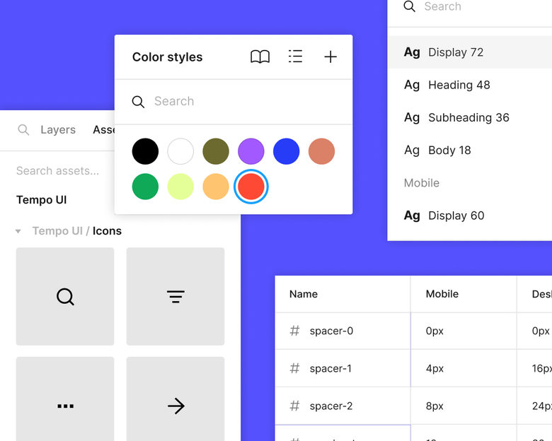
Image Source: Figma
Figma stands as the leading force in UX design today, with 63% of designers choosing it as their go-to UI tool. This cloud-based platform has reshaped the scene of design team operations by creating a space where creativity and functionality work together seamlessly.
Figma’s Real-Time Collaboration Features
The heart of Figma lies in its powerful collaboration features that happen in real time. Unlike other design tools, Figma lets team members work together on the same file at once. Team members can see each other’s cursors and changes as they happen, which cuts down the need for endless feedback cycles. The built-in commenting system lets people give contextual feedback right inside the designs. Users in observation mode can follow presenters without losing their way.
Figma’s Design System Capabilities
Figma shines at building and maintaining cohesive design systems. Teams can establish a single source of truth through shared component libraries that keep projects consistent. On top of that, Figma’s variables and modes help implement design tokens for light/dark themes and brand variations. The platform’s design system analytics track how components are used, which helps teams boost adoption and make smart choices about system improvements.
Figma Prototyping for UX Designers
Designers can turn static designs into interactive experiences in Figma without writing code. They can set up interactions between frames—clicks, hovers, and scrolls—while smart animate creates smooth transitions between similar objects automatically. The prototype viewer adjusts to fit any screen size, which lets designers test their work on devices of all types. Having design and prototyping in one tool makes the workflow much smoother.
Figma’s AI-Powered Design Features
Figma has rolled out a suite of AI tools that improve productivity throughout the design process:
- Visual Search: Upload images or select canvas areas to find visually similar designs across team files
- Asset Search: Uses AI to understand what users mean in their searches, finding relevant components even when search terms don’t match names exactly
- Make Designs: Creates UI layouts from text prompts to give quick first drafts
- Background Removal: Removes backgrounds with just one click
- Smart Layer Naming: Organizes and names layers based on their content automatically
These AI tools remove common workflow obstacles, letting designers focus on what matters most—creating exceptional user experiences.
Adobe XD: The Integrated Creative Suite Tool
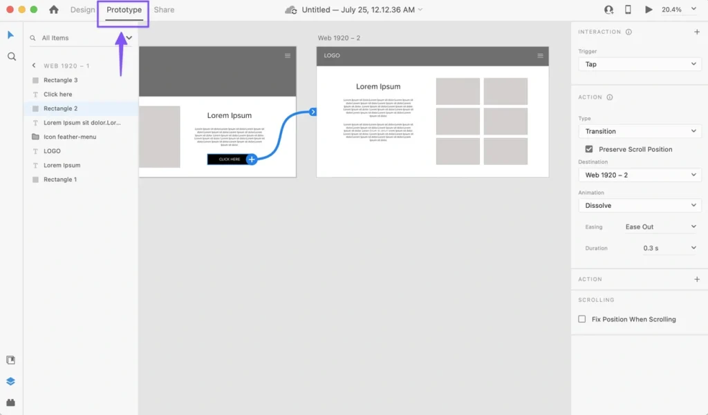
Image Source: Designlab
Adobe XD stands out as Adobe’s dedicated UX design platform that connects smoothly with the Creative Cloud ecosystem. Designers who work with Adobe’s suite of tools will find XD provides a familiar environment and specialized features to create interactive interfaces.
XD’s Component States and Interactions
XD lifts prototyping capabilities through its strong component states system. Designers create components with multiple variations—Default, New, Hover, and Toggle states—which makes creating interactive elements simpler. You can manage everything from a single source instead of duplicating components for different interaction states. The Toggle state adds bi-directional tap interactions between states automatically. This makes interactive elements like checkboxes and toggle buttons work with minimal effort. The interactions you define on a main component pass down to all instances, which gives your project consistency.
Adobe XD’s Developer Handoff Features
XD optimizes the design-to-development handoff process through complete design specs. You can select output formats that match your platform—iOS (with assets in 1x, 2x, and 3x), Web (with assets in 1x and 2x), or Android. Developers look at every aspect of your design, from dimensions and spacing to colors and typography. They can pull assets straight from the shared specs, which removes the need for separate exports. XD lets you share both publicly and privately. Private sharing gives you control over each team member’s permissions.
Integration with Adobe Creative Cloud
Adobe XD’s power comes from its Creative Cloud ecosystem integration. You can bring assets from Photoshop, Illustrator, and InDesign directly into XD projects while keeping their quality and editability. Creative Cloud Libraries act as a central hub for design elements—graphics, images, colors, and text styles—that update automatically across Adobe applications. Changes to linked assets in one application reflect across all projects instantly. Your prototypes saved to Creative Cloud Files become available on all devices and the Adobe XD mobile app right away. XD’s color management ensures colors look the same across all Creative Cloud applications.
XD naturally extends the workflow of UX designers who use Adobe’s ecosystem. It transforms static designs into interactive experiences while maintaining continuous connection with other Creative Cloud tools.
Sketch: The Designer’s Vector Toolkit
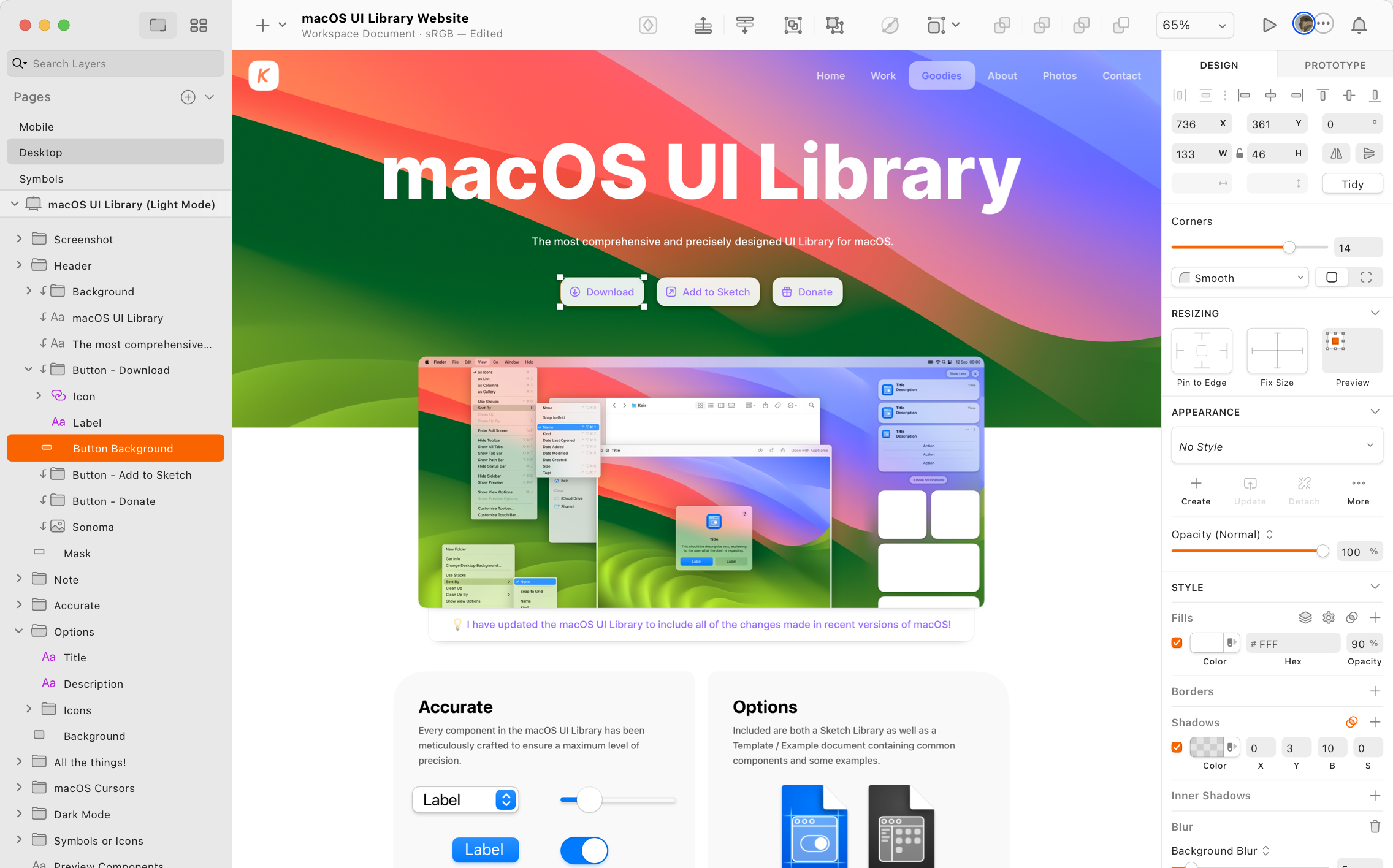
Image Source: Sketch
Sketch is a focused vector toolkit that helps designers work efficiently. This 13-year-old design tool has become essential for many UX designers because of its accessible interface and reliable capabilities.
Sketch’s Symbol Library and Components
Sketch’s Symbol system stands at the heart of its functionality. Designers can create reusable elements across different artboards and pages. These Symbols act as master components that keep projects consistent and save design time.
My experience with Sketch’s Symbols has shown these valuable capabilities:
- Nested Symbols that allow for complex component hierarchies
- Shared Libraries across documents and teams for natural collaboration
- Symbol Overrides for customizing instances without breaking the master component
The Library feature lets teams share master Symbols between documents. Documents with instances receive notifications whenever a Symbol gets updated in the Library file. This ensures design consistency throughout projects.
Sketch Cloud for Team Collaboration
Sketch Cloud changes the solo design process into a team experience. It goes beyond online design storage to provide a platform for live team interaction and project management.
Team members can work on the same document at once with co-editing capabilities. Changes update instantly so everyone sees the latest work live. The reliable version history tracking helps teams track changes and return to previous versions as needed.
Project administrators have full control through the permission management system. They can invite teammates, clients, or developers to access workspaces, projects, or specific documents based on their roles. Developers don’t need to buy or learn Sketch—they can check designs and export assets from any browser without cost.
Sketch Plugin Ecosystem for UX Enhancement
Sketch stands out from other UX design tools because of its extensive plugin ecosystem. A passionate developer community has created thousands of plugins that boost Sketch’s built-in capabilities.
Plugins like Stark help UX designers test accessibility to ensure color-blind friendly designs that meet contrast requirements. Designer-developer handoff becomes smoother with collaboration plugins like Zeplin and Avocode. Content generation plugins help add realistic data to designs.
Recent versions have substantially improved plugin management. The system disables incompatible plugins automatically. Updates happen naturally, which reduces workflow disruptions that used to challenge users of this top UX design tool.
InVision Studio: The Prototyping Specialist
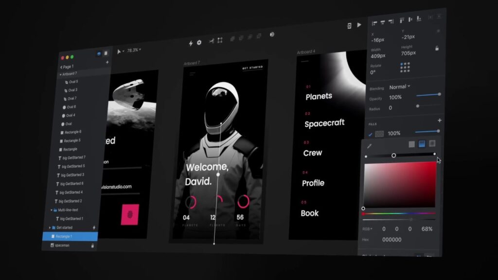
Image Source: vaexperience
InVision Studio excels as a specialist tool in the UX design toolkit. Its focus on high-fidelity prototyping and advanced animations makes it unique. Unlike other design tools that need multiple applications for animation work, Studio brings design and animation together in one platform. This makes it a powerful choice for UX designers who want to create interactive prototypes quickly.
InVision’s Animation and Transition Tools
Studio’s animation capabilities make it stand out from other ux design tools. The platform offers an easy-to-use approach to complex animations that feels “like Keynote’s Magic Move but in an advanced way”. Studio automatically connects matching layers between source and destination screens and animates the differences. This smart feature recognizes duplicated objects that have similar layer names, which saves designers time.
UX designers get substantial practical benefits:
- Create multi-step animations with timer controls for video-like intros and outros
- Develop parallax effects using swipe triggers for scroll-based animations
- Test prototypes directly on mobile devices by scanning QR codes
Studio’s real strength lies in its smooth animation workflow. Designers can create complete animated prototypes from scratch in as little as two hours—a task that usually needs multiple applications.
InVision’s Design System Manager
The Design System Manager (DSM) serves as a central hub that helps teams organize and maintain design components. This tool acts as both a library and control center where teams store brand and UX components. DSM lets designers:
- Organize design elements into categorized folders for easy access
- Implement design tokens that developers can use directly in their code
- Sync designs instantly to InVision for smooth project management
DSM works like “the Ford of design systems,” which helps teams update and scale without leaving their preferred design tools.
Collaborative Feedback in InVision
InVision puts collaboration at the heart of the design process. The platform lets team members design and comment live while global syncing keeps everyone updated.
The commenting system works smoothly—even for clients who don’t know design software well. Users can switch to “Comment Mode” and leave feedback directly on specific parts of the mockup. Comments show up as numbered dots that disappear once addressed, which keeps the feedback process organized.
The platform creates an environment where designers, developers, and stakeholders can all participate in the feedback process effectively. This accessibility for non-designers makes InVision’s collaborative features valuable.
UXPin: For Data-Driven UX Design
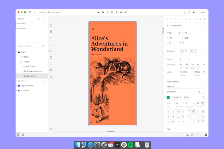
Image Source: UXPin
UXPin provides powerful tools that connect design and development teams to create individual-specific experiences based on data. The code-based platform works exceptionally well when you have projects that need high-fidelity interactive prototypes which look almost identical to final products.
UXPin’s Accessibility Testing Features
UXPin stands out from other ux design tools through its built-in accessibility features that help designers test designs in one place. The platform includes a contrast checker that reviews text readability against WCAG standards with up-to-the-minute data analysis. It clearly shows when designs meet Level AA (contrast ratio of at least 3:1 for large text or 4.5:1 for smaller text) or Level AAA requirements.
Designers can preview their interfaces through different types of visual impairments with the color blindness simulator:
- Red-green color blindness (Deuteranomaly, Deuteranopia, Protanomaly, Protanopia)
- Blue-yellow color blindness (Tritanomaly, Tritanopia)
- Complete color blindness (Achromatomaly, Achromatopsia)
These built-in tools make accessibility testing more efficient, though they currently focus only on color evaluation.
Creating Design Systems in UXPin
UXPin offers detailed design system features that ensure consistency in large-scale projects. Designers can create libraries of colors, typography, assets, and interactive components that act as a single source of truth.
UXPin’s unique strength lies in knowing how to add detailed documentation within the design system. This documentation follows projects through development and automatically creates specifications for developers with markup, imports, and component names.
UXPin Merge lets design teams import code components straight from repositories. Designers can work with the same building blocks as developers, which substantially reduces development time by about 50%.
UXPin’s Prototyping Capabilities
UXPin shines at creating interactive prototypes that feel like finished products. The code-based foundation enables advanced interactions through several key features.
States help designers create multiple variations of components without duplicating elements. Variables enable data collection and transfer between screens, which makes prototypes behave more realistically.
The platform’s Conditional Interactions help designers implement “if-then” and “if-else” logic to prove user inputs right. Expressions provide simple JavaScript functionality for complex interactions. These features help create prototypes that gather meaningful user feedback during testing.
UXPin has earned its place among top ux design tools through informed capabilities that effectively connect design and development, despite competition from older tools.
Axure RP: For Complex Enterprise UX Projects
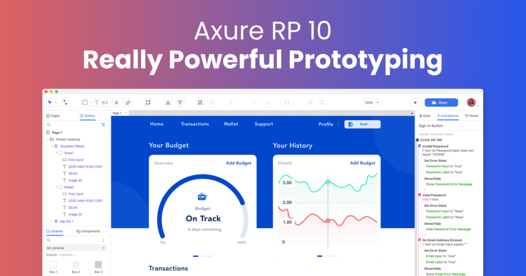
Image Source: Axure RP
Axure RP emerges as one of the strongest prototyping platforms for complex enterprise UX projects. This powerful ux design tool excels where complex interactions and detailed specifications become mandatory requirements.
Axure’s Advanced Interaction Specifications
Axure RP sets itself apart with sophisticated interaction capabilities that let designers create highly functional prototypes without coding. Its event-action-case system forms the foundation. Designers can employ different events (clicks, mouse enter/exit, key presses) and apply conditional logic with “if-then-else” statements to create realistic interactions. This conditional approach mirrors how actual software responds to user inputs and offers a great way to get complex scenario simulations.
The platform includes variables, expressions, and data-driven interactions—critical elements for enterprise applications that need data validation and processing. I can create functioning forms with text fields, droplists, radio buttons, and checkboxes through simple drag-and-drop operations.
Axure Cloud for Team Collaboration
Axure Cloud delivers detailed collaboration features for enterprise teams. The platform makes shared work possible on the same prototype through a check-in/check-out system. This controlled environment stops conflicting changes and shows who works on each component.
Axure Cloud for Business addresses enterprise security needs with:
- User management and permissions control
- Single sign-on capabilities
- SOC 2 Type II and ISO 27001 certification
- Optional on-premises deployment
Stakeholders and developers get free reviewer accounts to view prototypes, comment on designs, and inspect CSS and image assets without extra costs.
When to Use Axure in Enterprise Projects
Axure proves most valuable where top ux design tools must handle complexity beyond simple prototyping. I recommend it for projects that need:
Data-driven interfaces where users check information and make decisions based on that data. The repeater widget helps create sortable, filterable tables that mirror real database interactions.
Enterprises with strict security requirements, extensive stakeholder approval processes, and integration needs with tools like Jira and Confluence will benefit from Axure’s enterprise-focused approach.
Miro: The UX Research and Planning Tool
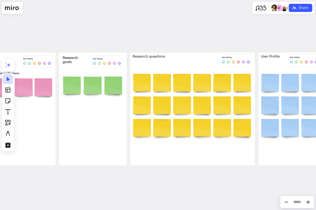
Image Source: Miro
Miro has emerged as a standout ux design tools platform. This collaborative visual workspace shines at UX research organization and planning. Over 90 million users and 250,000 companies depend on this platform. Teams use Miro to visualize and line up their complex user experiences.
Miro for User Journey Mapping
Miro’s infinite canvas turns abstract customer insights into clear journey maps. Teams can see the whole user experience at a glance. UX designers can build complete journey maps on the platform. These maps show customer interactions at every touchpoint with rich media and data right on the canvas.
The platform’s journey mapping helps teams to:
- Learn about their customers’ needs better
- See complex journeys clearly
- Help teams work across departments to create ideal customer experiences
Designers usually start by setting their map’s goal and scope. They list different journey phases and add content in ways that work best for their project.
Collaborative Ideation in Miro
Miro changes the solo ideation process with features built for shared brainstorming. The sticky notes tool lets teams capture ideas faster. Teams can create multiple notes at once with bulk mode. A built-in timer keeps brainstorming focused. The voting tool helps teams pick the best concepts together.
The mind mapping feature shows ideas visually. Designers build branches with user-friendly controls and shortcuts. Teams connect through Miro’s video chat or Zoom integration. Remote work feels just like being in the same room.
Miro’s UX Templates and Resources
Miro has a huge library of UX-specific templates that make research and design smoother. These templates cover everything from service blueprinting to empathy mapping, user flows, and marketing funnels.
The UX templates give teams structured frameworks. This ensures work stays efficient, consistent, and collaborative throughout projects. Teams find these templates especially helpful when planning research, creating case studies, and prioritizing features. Designers can adapt any template to their needs, work with team members live, and share findings across their organization.
Optimal Workshop: The UX Research Platform
Image Source: Optimal Workshop
Optimal Workshop’s specialized UX research tools revolutionize how designers collect and interpret user data. The company pioneered the first online card sorting tool. Their platform combines powerful features with an easy-to-use interface that makes professional UX research available to teams of all sizes.
Card Sorting with Optimal Workshop
OptimalSort, their card sorting tool, shows designers how users naturally group information. The platform gives three options—open (users create and name their own categories), closed (users sort into predefined groups), and hybrid (a mix of both). This research method reveals users’ mental models and gives designers solid data to organize content structures instead of relying on guesswork.
Optimal Workshop’s platform creates automated visualizations that spot patterns in user categorization quickly. Their platform records sessions so researchers can watch how participants think during categorization tasks.
Tree Testing for Information Architecture
Tree testing works alongside card sorting to prove the findability of information within your proposed structure. Many call it “reverse card sorting” because it shows how well users can direct themselves through your site’s hierarchy. Together with card sorting, tree testing gives detailed insights into your information architecture‘s performance.
A tree test lets participants explore a text-only version of your site structure (like a sitemap) while they complete specific tasks. The results show:
- How often users find information
- Routes users take to reach destinations
- Time needed for each task
- Places where users get lost
Analyzing UX Research Data
Optimal Workshop’s platform turns complex research data into applicable information. Their analysis tools spot patterns among participants and help you find specific problem areas. The platform’s AI assistant speeds up analysis by finding hidden patterns in qualitative data.
UX designers who want evidence-based decisions will find Optimal Workshop’s tools are the foundations for building easy-to-use information architectures based on real user behavior rather than guesswork.
Balsamiq: For Quick Wireframing
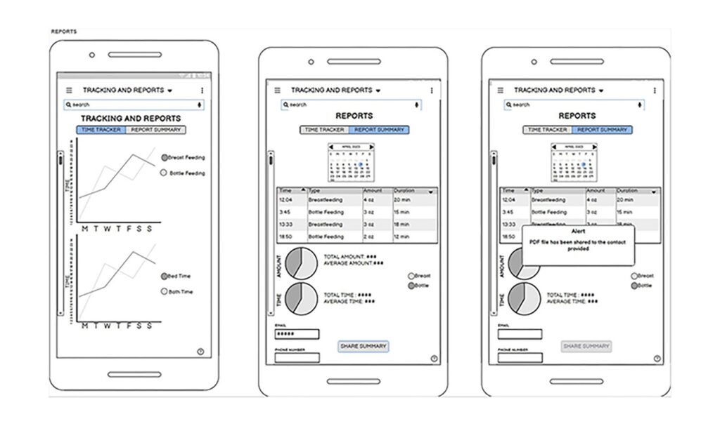
Image Source: balsamiq.com
Balsamiq has become my favorite wireframing tool to turn abstract ideas into visual concepts. This specialized ux design tool excels at quick, low-fidelity wireframing and stays away from high-polish design details that slow down the creative process.
Balsamiq’s Rapid Wireframing Features
The speed-focused interface makes Balsamiq stand out. The platform gives you three ways to create wireframes:
- Drag-and-drop from an extensive library of UI components
- Quick search functionality to find exactly what you need
- “Quick draw” feature for immediate sketching
The sort of thing I love about Balsamiq is its sketch-like, hand-drawn look. This visual style keeps stakeholders looking at functionality and structure rather than getting caught up in colors and pixel-perfect details. The pre-built UI components and customizable templates let me create wireframes as quickly as ideas come to mind.
Using Balsamiq in Early Design Phases
Balsamiq really shines at the time of original design phases through its support for both ideation and validation. My approach during ideation is to create multiple versions quickly—putting quantity ahead of immediate quality. This method breaks through creative blocks and aids in generating different solutions.
Balsamiq wireframes work as communication tools for validation. They bridge the gap between abstract concepts and actual implementation. Creating clickable prototypes by connecting wireframes shows user flows without spending too much time.
Balsamiq for Non-Designers
Balsamiq’s greatest strength might be how easily team members without design backgrounds can use it. Product managers, developers, founders, and business analysts create professional-looking wireframes without special design training. The easy-to-use interface skips complicated features that could overwhelm non-designers.
So, Balsamiq has become a great way to get cross-functional collaboration going. Everyone on the team can visualize and share ideas effectively, whatever their design expertise. This shared design communication leads to fewer misunderstandings and ends up reducing rework throughout the project.
Zeplin: The Design-to-Development Bridge
Image Source: zeplin.io
Zeplin acts as a crucial bridge that turns creative designs into buildable assets in the design-to-development workflow. Teams use this specialized tool to document design decisions, manage consistent systems, and deliver specifications that developers can implement easily.
Zeplin’s Design Specification Features
Zeplin creates a single source of truth for design specifications. The sort of thing I love about it is its version control—tracking changes for each screen automatically, similar to Git’s code tracking. This creates a complete audit trail with version history, commit messages, and visual comparisons between iterations. The platform organizes designs in a standardized grid, which differs from the subjective ordering found in design tools’ open canvases. The platform documents designs through:
- Annotations that show design behavior with descriptive GIFs/videos
- Flow visualization with dynamic connectors and labels for complete user paths
- Version Diff that shows pixel-level changes between design iterations
Managing Design Systems in Zeplin
My experience shows how Zeplin boosts design system adoption in organizations. The platform generates design tokens for colors, text styles, and spacing automatically and keeps these values centrally documented and updated. Product teams that use design systems can see exactly when and where to use the correct elements. The Connected Components feature links design components to their code counterparts and connects to Storybook, GitHub, or any other documentation source in the developer workflow.
Zeplin’s Developer Collaboration Tools
Zeplin changes how developers work with designs. The platform exports assets in formats ideal for specific platforms (web, iOS, Android) and eliminates manual export work. Developers access design specifications directly from the interface, including measurements, assets, and code snippets tailored to their platform’s needs. Layout Specs show how layers should behave according to their parent containers and display Auto Layout and Constraints as configured in design tools. A developer said it best: “Without Zeplin, we could still build an app, but it would look completely different from what designers had in mind”.
Hotjar: For User Behavior Analysis

Image Source: Hotjar
Hotjar stands out among ux design tools because it shows how users actually interact with your designs. This behavioral analytics platform combines visual tools with user feedback to paint a complete picture of ground user experiences.
Heatmaps and User Recordings in UX Design
Color-coded visualizations in Hotjar’s heatmaps turn complex user interaction data into practical visual insights. These maps show exactly where users click, tap, scroll, and move their cursors on your pages. The click heatmaps highlight the best-performing buttons and CTAs, while scroll maps show where users stop scrolling and lose interest. Rage click maps highlight areas of user frustration and identify problematic elements that need quick fixes.
Session recordings work like video playbacks of real users navigating your site. These recordings give vital context behind the numbers and show why users take specific actions. My analysis of these recordings helps spot common obstacles, usability issues, and friction points that might stay hidden otherwise.
Integrating User Feedback with Hotjar
Users can leave contextual comments at any point during their experience through feedback widgets. They can highlight specific page elements while giving ratings and comments. On top of that, Hotjar’s surveys help gather qualitative insights about user priorities and experiences. The platform connects survey responses with session recordings from the same users to give complete context to their feedback.
Using Hotjar Data to Improve UX
Without doubt, Hotjar excels at spotting problem areas that traditional analytics miss. To name just one example, the platform tracks u-turns (when users immediately return to their previous page) and rage clicks (rapid clicking on unresponsive elements) that signal user frustration.
These behavioral patterns help me make informed decisions to improve user experience. We focused on:
- Content placement optimization based on scroll depth analysis
- Navigation path redesign from recording insights
- Quick fixes for usability issues found in user feedback
Hotjar turns user behavior analysis into a systematic process backed by visual evidence and direct user input.
Framer: The Advanced Prototyping Tool
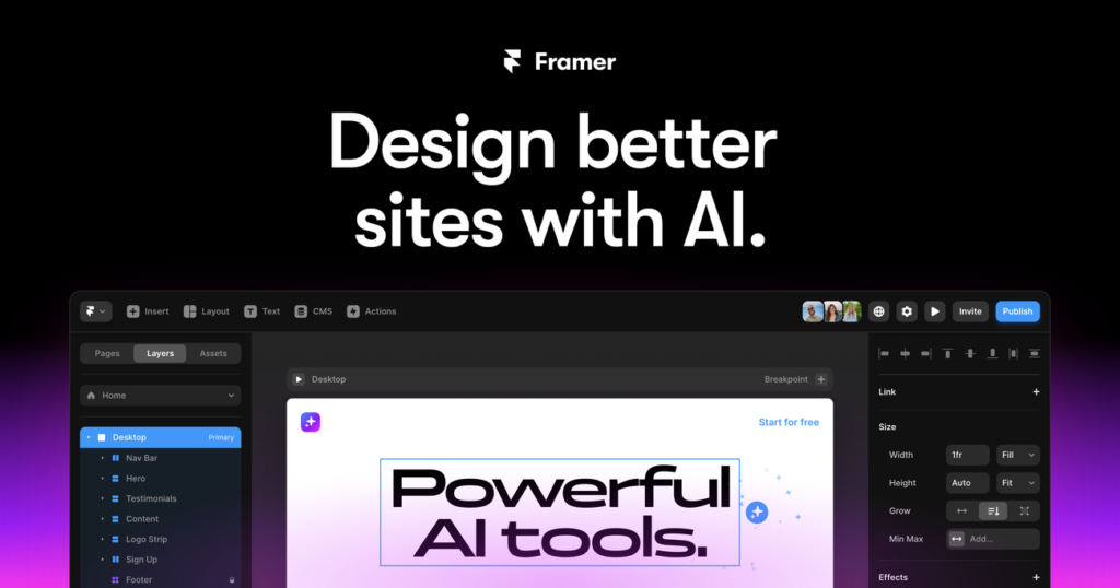
Image Source: Framer
Framer is a powerful tool that helps designers create highly interactive prototypes which look and feel like final products. This visual platform stands out among ux design tools by combining design flexibility with advanced interactions to demonstrate complex behaviors.
Framer’s Interactive Components
The platform’s resilient infrastructure improves prototyping through its component system. You can create a component by pressing Command+K to access the quick menu. These components are versatile and include:
- Multiple variants to create different styles within a single component
- Variables that let you edit properties outside the component
- Effects to define animations based on events like scroll, hover, and click
Framer components also support dynamic sizing with “fit content” options that give you precise control over layout flexibility.
Code-Based Prototyping in Framer
Framer extends its capabilities through standard React and JavaScript integration. Code Components work as custom React elements that render directly on the canvas, in preview, and on published sites. These components come with:
- Property Controls to visually manipulate component props
- Auto-Sizing options that work naturally in any layout
- Preview functionality that updates automatically when you save changes
Code Overrides act as Higher Order Components to modify Layer and Component properties. This enables complex behaviors without requiring extensive coding knowledge.
Framer’s Design-to-Code Features
Framer helps bridge the gap between design and development by simplifying the transition from mockups to functional websites. The platform’s Figma plugin keeps your layers, groups, and overall structure intact when importing designs. Your imported designs can be improved with:
- Interactions and animations without code
- Responsive layouts optimized for mobile viewing
- CMS features that make content management easy
When to Use Framer in Your UX Workflow
Framer works best for projects that need high-fidelity prototypes with complex animations. The tool is ideal for:
- Creating interactive app and website prototypes with advanced animations
- Developing experiences that use multiple gestures and inputs
- Projects where teams need smooth collaboration with up-to-the-minute feedback
The JavaScript-based interaction support provides customization options that other ux tools can’t match.
Comparison Table
| Tool | Main Focus | Key Features | Collaboration Capabilities | Integration/Export Options | Pricing Range |
|---|---|---|---|---|---|
| Figma | Standard Design Tool | – Immediate collaboration features – Design system capabilities – Smart animate transitions – AI-powered design tools | Team members work together with cursor tracking | Creative Cloud integration | – Professional Plan: – Collab seat: $3 – Dev seat: $12 – Full seat: $16 |
| Adobe XD | Creative Suite Integration | – Component states system – Toggle interactions – Detailed design specs | Public and secure private sharing options | Smooth integration with Creative Cloud apps | Not mentioned |
| Sketch | Vector Design | – Nested Symbols – Shared Libraries – Symbol Overrides | Immediate co-editing via Sketch Cloud | Extensive plugin ecosystem | – Standard Subscription: – Annual billing: $10 per Editor – Monthly billing: $12 per Editor |
| InVision Studio | High-Quality Prototyping | – Advanced animation tools – Multi-step animations – Timer controls | Design and commenting with global syncing | Design System Manager (DSM) integration | Not mentioned |
| UXPin | Analytical Design | – Built-in accessibility testing – Code components – Conditional interactions | Team libraries and documentation sharing | Code component import via UXPin Merge | $6-$119/Month |
| Axure RP | Complex Enterprise Projects | – Advanced interactions – Conditional logic – Data-driven prototypes | Check-in/check-out system for teamwork | Jira and Confluence integration | – Axure RP Pro: $29 per user (annual billing) or $34 (monthly billing) – Axure RP Team: $49 per user (annual billing) or $57 (monthly billing) |
| Miro | UX Research & Planning | – Trip mapping – Mind mapping – Voting tools | Smooth collaboration with video chat | Zoom integration | Not mentioned |
| Optimal Workshop | UX Research Platform | – Card sorting – Tree testing – AI-assisted analysis | Session recording capabilities | Not mentioned | Not mentioned |
| Balsamiq | Quick Wireframing | – Drag-and-drop components – Quick draw feature – Sketch-like esthetic | Clickable prototype sharing | Not mentioned | – Business Plan: $12 (2 projects) – Enterprise Plan: $18 (2 projects, annual billing only) |
| Zeplin | Design-Development Handoff | – Version control – Design specifications – Connected Components | Developer collaboration tools | Storybook, GitHub integration | Not mentioned |
| Hotjar | User Behavior Analysis | – Heatmaps – Session recordings – User feedback widgets | Shared analytics and recordings | Not mentioned | Observe Plan: – Plus: $39 – Business: $99 – Scale: $213 |
| Framer | Advanced Prototyping | – Interactive components – Code-based prototyping – React integration | Team feedback | Figma plugin integration | Not mentioned |
Conclusion
The right UX design tools can greatly affect project success and team efficiency. A tailored toolkit based on project needs works better than a single solution. Figma stands out for shared design work, and Axure RP becomes vital for complex enterprise projects. Tools like Hotjar and Optimal Workshop give valuable insights into user behavior that lead to better design choices.
AI capabilities have become standard features in platforms across the UX design world. Teams create better user experiences and work more efficiently when they stay current with these tools’ latest features. The success of UX design relies on more than powerful tools – it depends on how well you apply them in your design process.
My work has shown that mixing different tools creates a complete workflow that handles everything in modern UX design. You might use Figma for design, Zeplin for developer handoff, and Hotjar for user analysis. This smart combination helps teams tackle design challenges while giving users exceptional experiences.
FAQs
Q1. What are the top UX design tools professionals use in 2025?
The leading UX design tools in 2025 include Figma for cloud-based collaboration, Adobe XD for integration with Creative Cloud, Sketch for Mac users, InVision for prototyping, and UXPin for data-driven design. These tools offer features like real-time collaboration, advanced prototyping, and AI-powered design capabilities.
Q2. How does Figma stand out among other UX design tools?
Figma distinguishes itself with its powerful real-time collaboration features, robust design system capabilities, and integrated prototyping tools. It also offers AI-powered features like visual search, asset search, and smart layer naming, which enhance productivity throughout the design process.
Q3. What makes Axure RP suitable for complex enterprise UX projects?
Axure RP excels in handling intricate enterprise UX projects due to its advanced interaction specifications, conditional logic capabilities, and detailed documentation generation. It’s particularly useful for creating complex workflows and simulating realistic user interactions without coding.
Q4. How does Hotjar contribute to improving user experience?
Hotjar provides valuable insights into user behavior through heatmaps, session recordings, and user feedback tools. These features help designers identify problem areas, understand user interactions, and make data-driven decisions to enhance the overall user experience.
Q5. What are the key features of Framer for UX designers?
Framer offers advanced prototyping capabilities with interactive components, code-based customization options, and seamless design-to-code features. It’s particularly useful for creating high-fidelity prototypes with complex animations and gestures, making it ideal for projects requiring detailed interaction design.
Leave a Reply