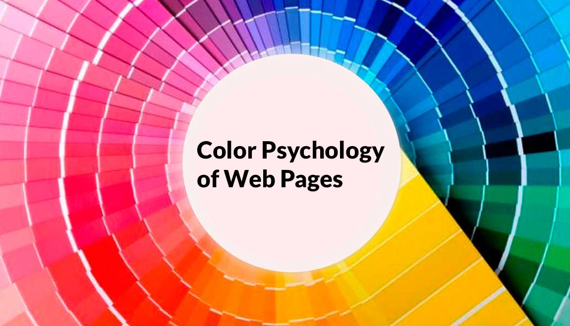
It is often said that color of a web design can impact a human being’s attitudes and emotions greatly. As soon as we behold a color, our eyes transmit it to a part of the brain, which again transmits innumerable signals to the other connected parts that rule our psyche. Thyroid glands play the major role here, by capturing signals and releasing hormones that eventually causes the mood sway and change in the behaviour.
How the color psychology affects conversion rate
Color is a witty notion. If employed in a correct way, appropriate time, suitable purpose and right audience, it can yield exceptional results to boost the conversion rate of your website. For instance, if you are intending to sell some kid’s stuff choosing a black and white background in your design can reduce the appeal of your website.
Kids are fond of hues; therefore, for a website selling their articles must include hues which are vibrant and eye-catching such as a splash of red, green and yellow. On the other hand, if you are selling some articles for women then it is important to understand which color would trigger them to purchase the items. You can, for instance, use more formal hues with a hint of playfulness in it like black and white with a twist of purple.
This may also work the same for men as they prefer more official hues than the playful ones. The bottom line says that you must choose hues for your web design while keeping in mind the demography you want to attract.
Tips to boost conversion rate through the usage of colors
Some tips that will help you succeeding in the improvement of the conversion rate have been enumerated below.
1. Avoid dull colors for women instead use vibrant hues like blue, green and purple—
There exists a sociological difference between color preferences in different age demography. In a survey, it was clearly shown that majority of the women preferred blue as their favourite hue followed by purple and green respectively.
The color pink may suggest femininity in a web design as most of the people think the color pink to be a universally-loved shade of women but that does not mean that this hue would be appealing to all of them. Therefore, employ other hues like blue, green and purple to revamp the appearance of your website which will, in turn, improve the conversion rate.
2. Use official hues like blue, green and black for men rather than earthy tones—
Similar to the association of pink with femininity, the hues like blue, green and black are associated with maleness. If you are selling items to men, be careful not to choose shades like purple, orange or brown.
3. Cultivate the trust of your customer with blue color—
Blue is such a shade which is favoured by most of the people. While going through the history of blue color you will find that time and again that this hue is considered to be the color of trust, loyalty, and peace. There exists a broader agreement in the community which deems blue to be the symbol of trustworthiness and serenity which is true.
4. The warnings use yellow—
The symbol for warning comes in yellow. Starting from wet floor to traffic signals or warning signs the hue can easily be observed due to its vibrancy. Yellow induces a high level of apprehension and thus should be used in a small amount so as not to make the design too loud for the visitors.
5. Represent the outdoor and environmental products in green—
The intuitiveness of green is profound and thus it is often used to market the products related to outdoor. According to the psychology of colors, it is the isolation effect that occurs when a particular item is focused on with a particular tint. This procedure works great for a call to action and for this purpose green is an exceptional choice.
6. Add black and white to your website for value and luxury—
The internal color psychology of a human being says that darker the tone, the more luxurious is the appearance of the site. Black adds sophistication and authenticity to a site. It is often observed that a page designed in lack appears more appealing to the customers.
On the contrary, white is often a forgotten shade as it is mostly used in the background of any page through numerous websites these days use a huge amount of blank space to create largeness and freedom.
Conclusion
A research unveils the fact that most of the product valuation is highly dependent on the hue was chosen on account of its marketing. You do not have to crack your brain to perceive that color affects the conversion rate immensely. Therefore, the upshot indicates that you are likely to be in a win-win situation if the right hues are chosen in a design.


 Sanjay Dey