
Companies with effective design systems complete their projects 34% faster. Our experience as UX designers shows how user experience principles can turn a good product into an outstanding one.
UX design goes beyond esthetic appeal. The strategic process creates products that solve real user problems while making solutions easy and enjoyable. The disability market controls over $13 trillion in disposable income, which proves that solid UX principles make both design and business sense.
We have studied and implemented seven core principles that leading designers rely on consistently. These guidelines help our clients boost user involvement, strengthen brand loyalty and increase conversions. These principles will help you create experiences that strike a chord with your users, whether you’re an experienced designer or new to the field.
The Principle of User-Centered Design
User-centered design (UCD) is the life-blood of effective digital experiences. This iterative design process puts users and their contexts first at every development stage. Their needs drive all design decisions. Design teams that involve users throughout the process get valuable insights about what works and what doesn’t. This creates an early warning system to improve designs before launch.
Measuring User Satisfaction Metrics
Calculating user experience needs both objective and subjective metrics. Research shows a strong correlation (r = .53) between user performance and satisfaction. Users rate designs better in satisfaction surveys when they can complete tasks efficiently. But designers should know about the “paradox of subjective satisfaction,” where objective and subjective metrics sometimes don’t match.
Good measurement has:
- Quantitative metrics: Success rates, error rates, Customer Satisfaction (CSAT), Net Promoter Score (NPS), and Customer Effort Score (CES)
- Qualitative insights: User behavior patterns, direct feedback, and digital experience observations
NPS alone isn’t enough to measure satisfaction. Using validated questionnaires with open-ended questions like “how could we improve?” works better. This gives context about problems and quality input for improvements. Task-level satisfaction questionnaires help put numbers to specific interactions. Designers can then find and fix usability issues that affect conversions.
ROI of User Research
Return on investment for UX work shows how design changes help business goals through increased revenue, cost savings, or better key performance indicators. Exact ROI figures can be hard to calculate. These estimates help organizations see that UX isn’t just good for users—it’s great for business.
A Forrester study found that every dollar invested in UX brings $100 in return—a huge 9900% ROI. User research saves money by catching problems early. Teams that recruit 10 B2B participants monthly see ROI between 87% and 168% with professional research tools. Larger scale research brings more benefits. Monthly recruiting of 300 participants can give ROI between 142% (B2C) and 243% (B2B) when using specialized tools instead of competitors’ options.
Balancing Business Goals with User Needs
Design projects face a constant challenge in finding balance between business objectives and great user experiences. UX designers want to create experiences that naturally address users’ needs while supporting business goals. Understanding successful business often comes before knowing what makes good user experience.
Great user experiences lead to happy users, more participation, and loyal customers—this helps both users and businesses. But great design and user experience alone don’t guarantee business success. Designers must learn to make trade-offs, set clear priorities, and cooperate with other teams to understand different aspects of product success.
Creating exceptional designs means finding the sweet spot where both users and business can succeed. Business needs often follow naturally when user needs come first.
Tools for Tracking User Behavior
Modern UX analytics tools give designers an edge by taking guesswork out of important decisions. Good tracking mixes traditional analytics with digital experience insights. Google Analytics shows design teams potential issues through numbers, while platforms like Hotjar give quality insights through heatmaps, recordings, and surveys.
Session recording tools capture real user interactions automatically. Designers can watch each user’s full experience and check if the numbers are right. This quickly shows bugs or problems that might take weeks to find through A/B testing. Event tracking lets teams watch specific user actions over time, like button clicks, form submissions, or account logins.
Funnel analysis finds where users drop off during their trip, while path analysis works better for non-linear trips. Both methods work better with session recordings or interviews to understand why users leave. These combined insights help teams make data-driven decisions that improve both user experience and business results.
Consistency as a Business Advantage

Image Source: ProCreator
Consistency forms the foundation of user experience principles and delivers business benefits beyond attractive esthetics. Organizations that invest in consistency through design systems see substantial financial returns. Research suggests that every dollar invested in UX brings $100 in return, which translates to a 9900% ROI.
Reducing Development Costs Through Design Systems
A design system acts as a single source of truth for designers, developers, and stakeholders. It is “a collection of reusable components, guided by clear standards, that can be assembled together to build any number of applications”. This approach to consistency creates remarkable gains in efficiency across teams.
Research on design system productivity reveals compelling financial benefits:
- Design teams see 38% better efficiency on average
- Development teams achieve 31% better efficiency
- Organizations receive about $2.70 back for every dollar they invest in their design system
Here’s a practical example: A design system investment of $646,000 could save $1,517,400 with just five designers ($5,000 monthly) and ten developers ($6,000 monthly) over five months. Teams can focus on solving complex problems instead of recreating simple components, which eliminates repetitive work.
Standardization makes the financial case even stronger. Reusable components cut development time and eliminate 35-50% of design and front-end development costs. The cost to redesign interfaces drops by about 60%.
Training Efficiency Through Consistent UX
Efficiency benefits of consistency go beyond development. User interfaces that maintain consistency reduce the learning curve for users and internal teams. Teams need less explanation and documentation, which cuts training costs.
Design systems help with employee onboarding too. New team members can use them as educational tools and references. Designers and developers can contribute meaningfully faster because they need less time to get up to speed.
Teams develop a unified language through consistency. This shared understanding prevents costly errors and rework by reducing miscommunication. Teams can focus on solving larger, complex challenges instead of debating simple interface elements.
These benefits multiply as teams grow. A design system creates a standardized workflow. Everyone from marketing to engineering can collaborate better with a common visual and brand language. Teams make decisions faster because they have fewer disagreements about design details.
Case Study: Consistency’s Impact on Conversion Rates
Consistency shows its business value through its direct effect on conversion rates. Forbes reports that consistent brand presentation across platforms can boost revenue by up to 23%. Users trust consistent brands more, which creates an environment that encourages conversions.
Brand recognition can improve by up to 80% just through color consistency. This makes your offerings memorable to potential customers. Users tend to buy from brands they recognize and trust.
Consistency builds perceived value too. The Nielsen Norman Group notes that “if, at a glance, users do not believe the site is worth their time and effort, then they have little reason to stay”. A consistent interface shows professionalism and reliability immediately.
E-commerce sites benefit greatly from consistency across product pages. Users can focus on making purchase decisions in competitive niches when product information, navigation elements, and call-to-action components create a predictable environment.
Multiple case studies confirm this through analytics data. Bryn Ray’s research showed that revenue changed by about 4% for every 1% increase in quality, with consistency as a key metric. Small improvements in consistency can lead to significant revenue growth.
Strategic Information Hierarchy

Image Source: archSEOlogist
Information hierarchy ranks among the most significant principles of user experience design that affects how users interact with digital products. A well-designed information architecture can increase website conversion rates by up to 200%. This creates a smooth path from awareness to action.
Conversion Funnel Optimization Through Hierarchy
The conversion funnel shows how potential customers move from their first awareness to completing desired actions. Information hierarchy acts as an invisible guide that directs users through this path. A carefully structured hierarchy will give users an easy way to find what they need, which boosts conversion chances.
Information architecture helps businesses spot and fix problems in their conversion funnels. Forrester Research shows this connection clearly—users who can traverse logically structured information take desired actions more often. These actions include making purchases, signing up for services, or reaching out to sales.
Here’s a ground example: an online retailer changed their product categories and improved search with better information architecture. This led to a 35% increase in checkout completions. The improvement happens because strategic information hierarchy makes the user’s experience smoother.
Bad information architecture creates major barriers. Think with Google’s research reveals that 53% of mobile users leave a website when navigation confuses them or takes more than three seconds to load. These abandonments directly hurt conversion rates and revenue potential.
A/B Testing Hierarchical Elements
A/B testing offers a scientific method to confirm hierarchical elements in user experience design. This approach compares two versions of a webpage, email, or other content to see which one better moves users through the conversion funnel.
A/B testing brings several benefits for optimizing information hierarchy when done right:
- It confirms hierarchy assumptions with actual user data
- It lets you refine continuously based on clear metrics
- It shows how small hierarchical changes affect conversion rates
User research should guide A/B testing to avoid common mistakes. Nielsen Norman Group states that random A/B testing is “the equivalent of throwing ideas at the wall to see which ones stick”. Testing variations without proper research might miss underlying issues.
Each A/B test needs clear goals, specific test variables, and measured statistical significance of results. Tree testing works well with A/B testing by measuring how easily users find items within existing or proposed information architecture without interface design influence.
Business-Critical Information Prioritization
Balancing user needs with business goals helps prioritize critical information. The process starts by identifying what matters most to users and the business, then structuring it properly.
These techniques help with prioritization:
- MoSCoW Method – Categorizing information as Must-have, Should-have, Could-have, or Won’t-have based on importance
- RICE Scoring – Evaluating elements based on Reach, Impact, Confidence, and Effort
- Visual Hierarchy – Using size, color, contrast, typography, and spatial relationships to guide attention
Visual hierarchy shapes how users process information. Research proves that elements sized by importance create natural viewing patterns that guide users to consume information in the right order. This principle helps business-critical information stand out clearly.
A travel booking platform showed these ideas work in practice. They rebuilt their information architecture with clearer navigation paths and search filters. This brought more repeat bookings and better customer reviews about usability.
The best information hierarchies match business priorities with what users expect. Despite technical limits, the goal remains simple: create structures that naturally guide users to what matters most—both to them and to your business goals.
Simplicity and Cognitive Load Management

Image Source: LinkedIn
Cognitive overload silently kills conversions, and businesses can’t ignore it anymore. Like computers, human brains have a limited amount of processing power. Users get frustrated and leave tasks unfinished when websites need too much mental effort. This directly affects your profits.
The Business Cost of Complexity
Complex user interfaces drain finances through multiple channels. We spent more on development because stylistically complex designs with many features need extra resources. Projects need extensive research, user testing, and repeated prototyping which costs more than simpler designs.
Complexity creates ongoing expenses through:
- Lower conversion rates (sites with clear navigation can increase conversions by up to 200%)
- More customer support needs
- More user errors that need fixing
- Fewer returning customers
The best reason to keep things simple is its effect on conversions. Purchases become easy when your website helps buyers reach their goals without overwhelming them. Yet 17% of potential customers leave their carts because interfaces are too complex and hard to use.
Measuring Cognitive Load
Cognitive load means the total mental resources needed to use a system. Designers can create better business outcomes by understanding this load. Three distinct types need measurement:
- Intrinsic cognitive load: The effort needed to learn new information and track goals
- Extraneous cognitive load: Mental processing that uses resources without helping users understand content
- Germane cognitive load: Mental effort users willingly put into finishing a task
Designers use several techniques to measure these loads. Users rate task difficulty on a scale for subjective measurements. Task completion time gives objective data—longer times usually mean higher cognitive demands. Eye tracking shows how much effort users need to process visual information.
Teams with limited resources can use the Sternberg Memory Test. Users find it easier to complete, and it still finds high-load situations well.
Simplification Strategies for Higher Conversion
Users become buyers more often when cognitive obstacles are minimal throughout their experience. Designers should remove extraneous cognitive load—processing that uses mental resources without helping users.
These strategies work well:
- Avoid visual clutter: Get rid of extra links, unnecessary images, and decorative design elements
- Build on existing mental models: Make use of what users already know from other websites
- Offload tasks: Show pictures instead of text, display previously entered information again, or set smart defaults
- Clear information architecture: Put content in logical, familiar categories
- Progressive disclosure: Show information step by step to avoid overwhelming users
Websites using these strategies see better conversions. Forms with fewer fields get 27% more completions. Pages with fewer distractions and links get more conversions.
Case Study: Simplicity’s Impact on User Retention
Happy users become loyal customers. Many don’t realize how simplicity helps keep customers coming back.
Research shows that 76% of users find information easily on websites with basic navigation elements. Simple mobile experiences work especially well for retention—mobile devices make up over 58% of global web traffic.
An online retailer simplified their checkout process by removing unnecessary form fields and making navigation easier. Their customer retention improved by 25% in six months. Even making their mobile site one second faster improved their conversion rate.
User behavior patterns give the most convincing evidence. Simplified designs lead to lower bounce rates and more time spent on site—both show better user retention. These numbers turn into revenue growth because returning customers generate 5-25 times more profit than getting new ones.
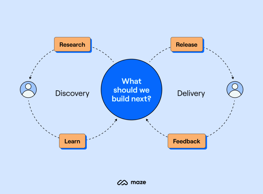
User Experience Feedback Mechanisms

Image Source: Maze
Systematic user feedback collection turns user experiences into practical business insights. UX professionals find making an impact the most rewarding part of their jobs, with 84% citing this as their favorite aspect. The challenge lies in collecting feedback that balances user needs with business goals.
Implementing Effective Feedback Collection
The success of feedback collection depends on timing and relevance. Users need time to experience your product before they can give meaningful feedback. The best approach is to wait until they complete important tasks. Your feedback requests should be subtle and not block essential information.
These feedback collection methods will give you the best results:
- Contextual collection: Place feedback tools within your product to capture specific input
- Surveys and questionnaires: Quick surveys that take less than a minute work best
- Analytics tools: Monitor user patterns through clicks, time-on-page, and conversion metrics
- Customer support interactions: Look for common issues in support tickets and conversations
Set clear goals before you start collecting feedback. Think about what customers want to tell you and their preferred communication channels as your campaign progresses.
Analyzing User Feedback Data
Your collected feedback needs structured analysis to provide practical insights. Start by combining responses from all channels into one system. This gives you a detailed view of user sentiment and helps spot patterns.
The next vital step is categorization. Break down feedback by urgency, user traits, topics, keywords, sentiment, and departments. Use codes to change qualitative comments like “I’m having issues subscribing” into measurable data such as “150 reports of sign-up issues”.
Sentiment and emotion analysis show the reasoning behind user thoughts. Understanding these emotional drivers helps you make targeted improvements.
Turning Feedback into Business Insights
Raw feedback becomes valuable when it connects to organizational goals. Show how feedback affects key metrics like customer service costs, acquisition expenses, order values, and conversion rates.
Present findings in stakeholder-friendly language that ties to ROI. Good UX goes beyond looks – it measurably improves business results.
Track and share business outcomes from feedback-driven changes. Document how improvements affect customer satisfaction and broader business goals. This builds support for continued UX investment.
Feedback-Driven Development Cycles
A feedback-driven development approach creates continuous improvement. Treating feedback as an ongoing process lets products evolve based on actual user needs.
New experiences need daily feedback checks. Later, you can set regular review schedules. Your feedback tools run constantly, so structured reviews ensure insights don’t go unused.
Combine feedback data with other UX research methods to gain deeper understanding. This combination reveals patterns across feedback channels and creates a strong foundation for decisions that work for both business and users.
Accessibility as a Market Expansion Strategy

Image Source: UX Collective
Designers can tap into a huge market by making their products more available to everyone. This approach goes beyond just following UX principles for regular users. Making products accessible creates business advantages and helps reach a wider audience.
The Business Case for Accessibility
People with disabilities make up 15% of the world’s population – over 1 billion people. This group has around $13 trillion in yearly spending power. Websites that aren’t accessible lose about $6.9 billion each year to their competitors. The numbers tell a clear story: accessible design makes good business sense.
Research shows that making products accessible helps all users. Features like voice control and auto-complete started as accessibility tools but became everyday conveniences. These dual-purpose features help companies grow while making their products better for everyone.
Compliance Requirements for 2025
Rules about accessibility keep changing faster. The European Accessibility Act (EAA) becomes fully active on June 28, 2025. This will change how websites and apps work in e-commerce, travel, and banking. The Americans with Disabilities Act (ADA) doesn’t have specific digital rules, but courts apply it to websites anyway.
The U.S. Department of Justice made it clear in 2022 that business websites count as “places of public accommodation” under ADA Title III. Web Content Accessibility Guidelines (WCAG) 2.2 serves as the current standard, with level AA compliance considered legally adequate.
Measuring Accessibility ROI
Forrester Research found something amazing – every dollar spent on web accessibility and user experience brings back $100. Adding accessibility features costs about 5-10% more during design. Fixing these issues later can cost 30-50% more.
Retailers see real benefits from accessibility. Tesco, a UK supermarket, earned £13 million more yearly after improving their digital accessibility. Companies can track success through conversion rates from people using assistive technology, new market access, and lower support costs.
Expanding Market Reach Through Inclusive Design
Better design means more market opportunities. Microsoft proved this with their Xbox Adaptive Controller, which made gaming available to 232% more people within a year.
Most users with disabilities (71%) leave websites they can’t use. Companies that focus on accessibility keep these customers and create better interfaces. This helps everyone use their products better across different situations, devices, and abilities.
Error Prevention and Recovery in UX Design

Image Source: FasterCapital
Human error causes almost half of all business interruptions. Companies must prioritize error prevention in user experience design to protect their finances. Poor software quality drained $2.08 trillion from the U.S. economy in 2020 alone. This shows why error management needs immediate attention in UX design.
The Cost of User Errors to Businesses
Business errors create a chain of financial problems beyond quick fixes. Research shows 10% of small-to-medium businesses lose over $50,000 for each hour of downtime. Small data errors add up fast – bad data cost U.S. businesses about $3.10 trillion yearly by 2016.
Money gets lost through:
- Developers spend 20% of their time fixing bugs
- Frustrated customers abandon transactions and take their business elsewhere
- Bad user experiences damage company reputation
- Security gaps lead to potential data breaches
Proactive vs. Reactive Error Handling
Teams can handle errors two ways: prevent them upfront or fix them later. Companies spend nearly 50 cents of every dollar just finding and fixing bugs during an application’s lifecycle.
Prevention strategies guide users toward correct actions through smart design constraints. Live validation and interfaces match how users think. These approaches stop both action-based errors (slips) and decision-based errors (mistakes).
Recovery strategies matter because errors still happen despite prevention. The focus shifts to reducing damage and making recovery simple through clear messages and easy fixes.
Error Analytics and Business Intelligence
Error tracking gives valuable business insights that lead to better systems. The data shows which errors hurt user satisfaction and business metrics the most.
Good analytics look deeper than basic error counts:
- How often specific errors happen and their patterns
- Which customer groups face the most problems
- How much different errors cost the business
- Time needed to fix issues and success rates
Designing Graceful Recovery Paths
Smart recovery paths help users stay confident while reducing negative effects. Systems should explain what went wrong clearly and give simple ways to fix it.
The basics include saving user input, offering undo options, automating fixes where possible, and using helpful error messages that teach rather than blame. Gmail’s “missing attachment” warning shows this approach well by catching a common mistake before users hit send.
Well-designed error handling creates strong interfaces that both prevent problems and help users bounce back when things go wrong.
Comparison Table
| UX Principle | Business Impact/ROI | Key Metrics/Measurements | Implementation Strategies | Primary Benefits |
|---|---|---|---|---|
| Accessible Design | $100 return for every $1 invested (9900% ROI) | Success rates, error rates, CSAT, NPS, CES | User research, behavior tracking, session recording, funnel analysis | 34% faster project completion, better user satisfaction |
| Consistency | $2.70 return for every $1 invested in design systems | Design team efficiency (38%), Development efficiency (31%) | Design systems implementation, efficient workflows, brand guidelines | 35-50% reduction in development costs, 60% reduction in redesign costs |
| Information Hierarchy | Up to 200% increase in website conversion rates | Conversion rates, bounce rates, navigation success rates | A/B testing, MoSCoW Method, RICE Scoring, Visual hierarchy | Lower user abandonment, better findability, higher checkout completions |
| Simplicity & Cognitive Load | Up to 27% higher form completion rates | Task completion time, eye tracking data, Sternberg Memory Test | Less visual clutter, progressive disclosure, clear information architecture | Lower bounce rates, better time-on-site, reduced support costs |
| User Experience Feedback | No direct numbers available | User sentiment, support tickets, behavioral analytics | Contextual collection, surveys, analytics tools, support interaction analysis | Ongoing product improvement, lower customer service costs |
| Accessibility | $13 trillion market chance | Conversion rates among assistive technology users, compliance metrics | WCAG 2.2 compliance, inclusive design principles | Broader market reach, better overall usability, legal compliance |
| Error Prevention | Reduces part of $2.08 trillion annual cost of poor software quality | Error frequency, resolution time, financial effect per error | Proactive constraints, up-to-the-minute validation, graceful recovery paths | Lower development costs, better user confidence, fewer support needs |
Conclusion
These seven UX principles show how smart design affects business success. Smart businesses no longer see UX as optional. It’s now a vital investment that yields returns from 99% to 9900% ROI in different cases.
Our research reveals clear benefits for each principle:
- Companies finish projects 34% faster with user-focused design
- Development costs drop by half with consistent design systems
- Strategic information layouts can double conversion rates
- Simple, clean interfaces help 27% more users complete forms
- Regular user feedback leads to better products
- Available design opens up a $13 trillion market
- Preventing errors saves companies from getting too pricey
Smart businesses should make these principles their priority for digital products. Companies that follow these guidelines perform better than their rivals. They see happier users, better conversions, and lower costs.
Excellence in UX design needs constant attention. Success comes naturally when teams apply these principles and track their results with solid metrics. This informed approach helps design choices match what users want and what businesses need.
Tomorrow belongs to companies that put UX design first. Businesses that become skilled at these principles will gain more market share. They’ll cut costs and build lasting advantages through exceptional user experiences.
FAQs
Q1. What are the key principles of user experience design? The seven essential principles top designers focus on are user-centered design, consistency, strategic information hierarchy, simplicity and cognitive load management, user experience feedback mechanisms, accessibility, and error prevention and recovery.
Q2. How does user-centered design impact business outcomes? User-centered design can yield a remarkable 9900% ROI, with every dollar invested bringing $100 in return. It leads to 34% faster project completion and improved user satisfaction by prioritizing user needs throughout the design process.
Q3. Why is consistency important in UX design? Consistency in design, often implemented through design systems, can reduce development costs by 35-50% and redesign costs by 60%. It improves efficiency for both design and development teams, leading to faster project completion and a more cohesive user experience.
Q4. How does simplifying user interfaces affect conversion rates? Simplifying interfaces and reducing cognitive load can increase form completion rates by up to 27%. It leads to decreased bounce rates, improved time-on-site, and reduced support costs by making it easier for users to interact with and understand the product.
Q5. What role does accessibility play in expanding market reach? Accessibility in design opens up a $13 trillion market opportunity by catering to users with disabilities. It not only ensures legal compliance but also improves overall usability for all users, potentially increasing conversion rates and expanding the customer base.
Leave a Reply